
Voice of People
Interactive data visualization of U.S. Presidential election history
Role
Data Analyst, Software Developer
Date
September 2021
Scope
Data VisualizationWeb Development
Beyond Red and Blue
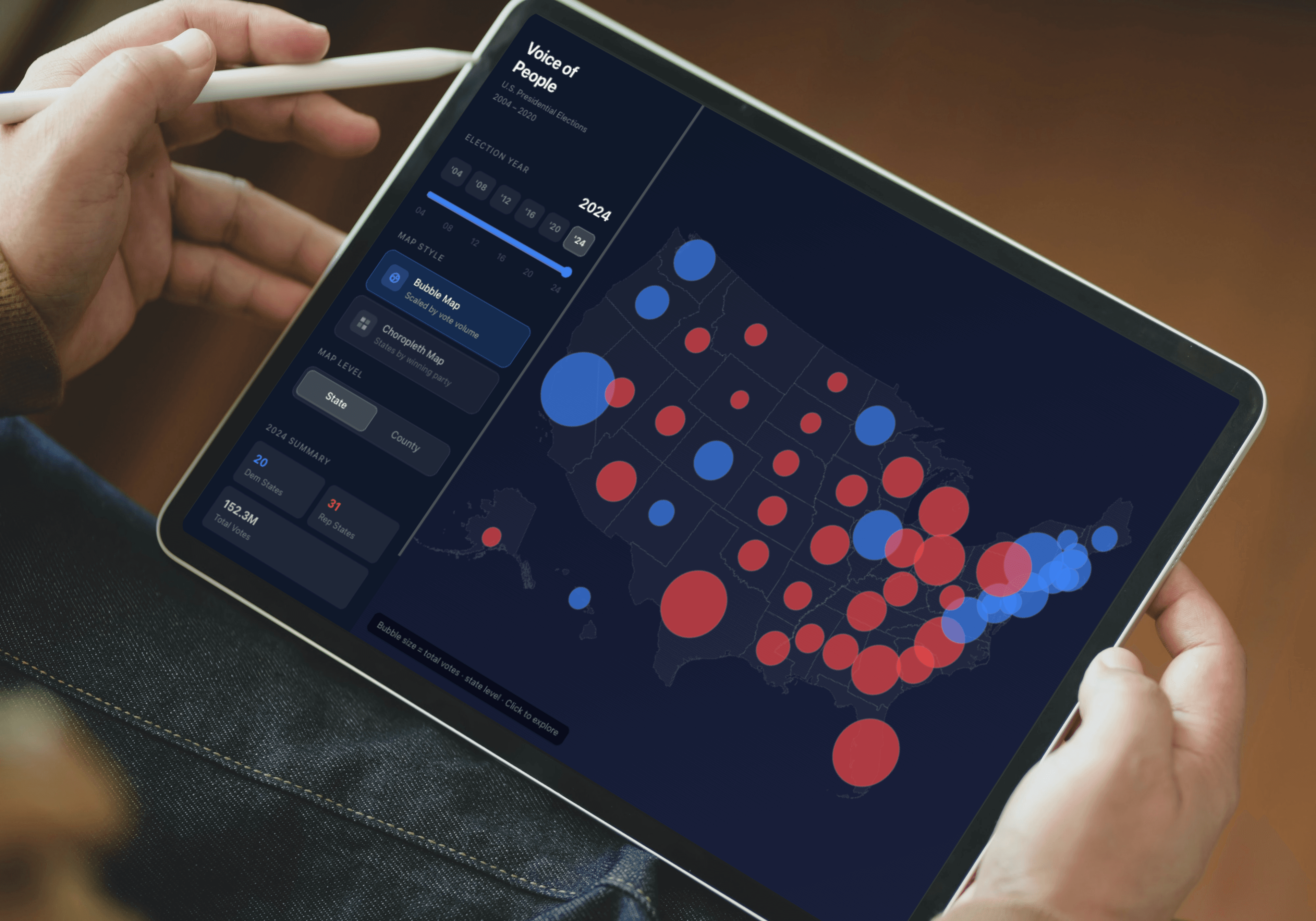
Winner-take-all maps make elections look like landslides. Voice of People goes deeper — covering every presidential election from 2004 to 2024 at both the state and county level, with two map modes and live vote tallies for each cycle.
Map Modes
- Choropleth Map: Colors each state or county by winning party — a clean geographic overview of how the political map shifted across six elections.
- Bubble Map: Scales each state by total vote volume, making population density legible. A small blue dot on the coast can represent far more voters than a vast red expanse inland.
Controls
Switch election year via the year buttons or timeline slider. Toggle between state and county granularity to zoom in on local patterns. A live summary panel updates in real time with Democrat/Republican state counts and total votes cast for the selected year.
Try It Live
Live DemoOpen in full